Imaginary. Creative OOH, Lenticular Bus Wrap ideas & copy
Client: Lionsgate
Role: Account Manager & Creative Manager
Project: Out-of-Home Campaign, Lenticular Bus Concept & Copy
The Brief
Lionsgate approached us to concept a standout lenticular bus wrap for Imaginary, a psychological horror film with a deceptively soft premise of a woman who returns to her childhood home and discovers her imaginary friend never left. But under the nostalgic surface was something far darker, repressed trauma, warped innocence, and the monster you make yourself.
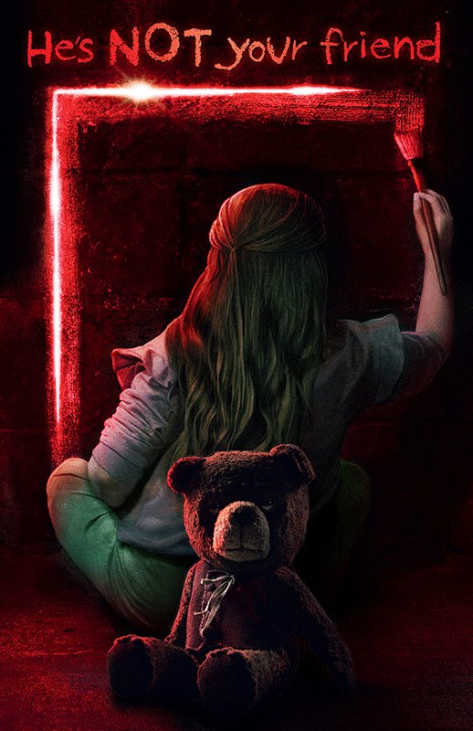
The challenge was that we weren’t given a suite of assets or dynamic character poses. Just one static artwork: a girl facing a wall, painting a glowing red line, with a teddy bear looming quietly behind her.
No movement, cast montage or horror iconography beyond a vague atmosphere. But the bus needed to move, stop people, and scare.
So we got strategic. I led the creative development of lenticular concepts, those double-image illusions that shift depending on your angle. Our job was to create a narrative that could only be told through this medium-meets-meaning technique.
Research Insights & Context
Genre Understanding: The film wasn’t pure slasher, it leaned more Blumhouse for Gen Z. That meant the scare needed to be accessible, psychological, and layered with emotional metaphor.
Cultural Resonance: Imaginary friends, childhood trauma, and “toys turned sinister” are genre catnip for audiences raised on Coraline, The Babadook, Inside Out, and even M3GAN.
Audience Expectations: Horror fans today are savvy. They expect double meanings. They love when visuals lie to them and words flip the script.
OOH Format Specifics: Lenticulars work best in five words or less per side, with clear semantic flips or tonal shifts that can be read in passing. This forced our copy to be tight, clear, and haunting.
We analysed the film’s tone, reread similar genre campaigns (Come Play, Ma, Smile), and even explored toy marketing tropes because that bear wasn’t just a prop, little Chauncey was the twist.
In the end, our concept hinged on twisting the comfort. If you can’t animate the monster, animate the trust.
The Creative Strategy
We asked ourselves: how do you make a static image move without motion?
The answer: semantic shift.
Change the meaning, not the image. Enter: the copy.
From the start, I led ideation sessions exploring how language alone could deliver the scare. I developed over 15 concepts, ranging from tone flips and sentence reveals to lightplay illusions and inner-voice contradictions. Ultimately, the winning route was deceptively simple:
“He’s your friend” in calm, comforting blue,
“He’s NOT your friend” in sinister red.
It used the power of lenticular illusion to turn reassurance into dread. No character movement needed, just a tonal twist in six words.
This concept played perfectly with the film’s themes:
Childhood memory vs. real-time horror
Trust vs. betrayal
Imagination vs. reality
We delivered a high-impact bus wrap that changed mood with motion. A child-friendly design on approach… then a gut-punch on the pass.
Alternative Lenticular Copy Concepts
Here are a few additional lenticular ideas I developed during conceptulising, each designed to shift meaning with movement or reveal a twist mid-read. Some use colour, others subvert expectations.
Childhood comforts. → Childhood curses.
She made him up. → Now he makes the rules.
Playtime’s over. → Now it’s his turn.
Sleep tight. → Don’t blink.
The past is gone. → It’s waiting upstairs.
He’s your friend. → He’s your fear.
Let’s play. → Let’s prey.
Draw the line. → Don’t cross it.
Make-believe. → Make him leave.
Playtime’s over. → Now it’s your turn.
Do you see him? → He sees you.
I also ideated many more visual changes, a lot of which we conceptualised, but didn’t work as the change has to be much more sudden, so we went with my idea of red to blue:
Clean background → Scribbled children’s drawings
Bear’s head tilt
Open eyes → Glowing eyes
Girl alone → Shadow behind her
Doorway open → Doorway pitch black
Text scale expands violently (“NOT” in He’s NOT your friend grows disproportionately, jolting forward.)
The young Ggrls’s body moves/ dissapears
The Result
The final lenticular design launched across high-traffic London routes on a full double-decker bus wrap that flipped copy as it passed. Audiences got the classic horror misdirect, comfort turned sinister, just like the film.
Despite a minimal base asset, we built a high-impact OOH moment that leveraged psychological unease, narrative tension and simple, effective wordplay.