The Hunger Games: The Ballad of Songbirds & Snakes
Client: Lionsgate UK
Agency Role: Creative Production & OOH Creative Management
Role: Account Lead, Copy Contributor, Visual Strategist
The Brief
There’s something uniquely surreal about trying to make war look beautiful on a Tuesday morning.
That’s what this campaign asked of us. To take a story about control, surveillance, state violence and resistance, and make it cinematic, legible, and somehow still safe for the Oxford Circus morning rush.
Lionsgate handed us the UK campaign for The Ballad of Songbirds and Snakes, and with it, one of their biggest theatrical rollouts of the year. We were told to make it feel epic. Expensive. Unignorable. The kind of thing that doesn’t just dress a city—but possesses it.
The brief was tough.
World premiere visuals. Five-way underground takeover at Oxford Circus. Nationwide OOH rollouts. Bus wraps that shimmered with threat. And a Capitol vs Rebels billboard war.
My role sat at the centre of all of it. I was tasked to lead every creative touchpoint, from early concepting to final execution, with a heavy hand in art direction, logistics, and narrative coherence.
The Strategy
The challenge wasn’t visual, it was emotional.
We didn’t just want people to look at the campaign. We wanted them to feel slightly haunted by it. Like they’d just walked past something they weren’t supposed to see.
From day one, we knew this wasn’t about replicating past Hunger Games campaigns. It was a prequel, major tonal shift. A return to where tyranny started, not where it ended.
We established four key creative priorities:
Make the franchise feel reborn, not recycled. This meant new colour palettes, a richer mood, and tone that matched the book’s slow-burn descent into dread.
Design for scale. Every placement, from corridors to bus wraps, needed to feel ornate, expensive, and intentional. No templated rollouts. Every space became a storytelling moment.
Balance reverence and rebellion. The narrative was politically fraught, so we treated every visual with care, building in symbology (snakes, birds, branches, gold) that echoed both elegance and threat.
Ground the spectacle in real craft. We weren’t handed final artwork, we built it, frame by frame, leaf by leaf, branch by twisting golden branch.
The Work
The Bus Wraps
The golden snake-and-songbird bus seen across London was all us.
The original teaser key art wasn’t designed for 3D vehicle wrap. I worked closely with our designer to reconfigure the entire composition, re-cutting and relayering branches, feathers, snakes, and flecks of gold from static poster art to wrap seamlessly across a double-decker.
It was a meticulous process: we had to navigate accessibility codes, vehicle panel grids, perspective distortions, and maintain a level of visual poetry that matched the campaign. The final result was one of the most arresting wraps of the year. A gorgeous teaser to get people slowly in the mood, weeks before the release.
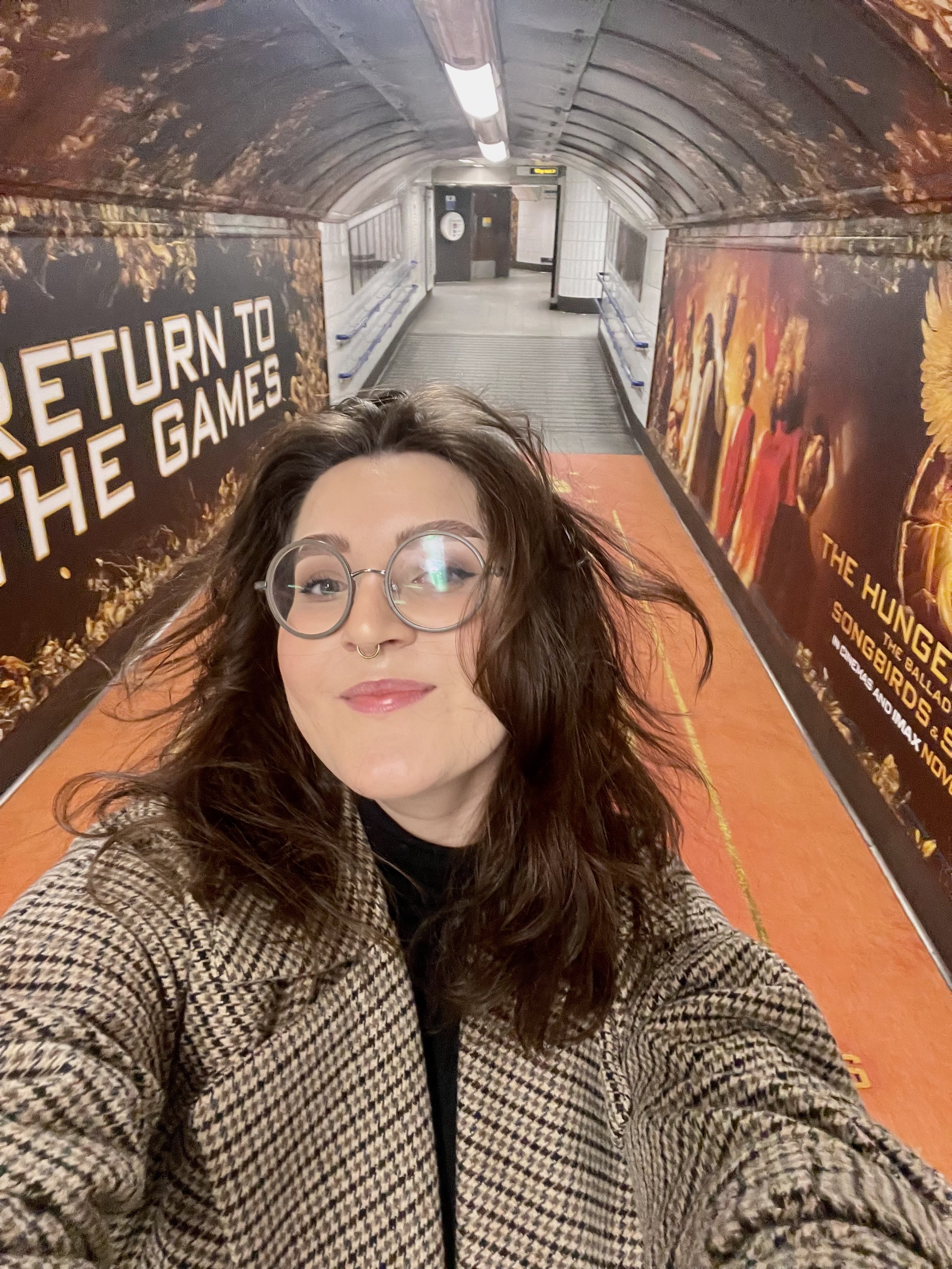
Oxford Circus Station Takeover
Five corridors, dozens of walls, thousands of daily impressions.
I led the ideation and creative production for Oxford Circus' tunnel dressing, one of the highest-footfall locations in the UK.
We began with themed corridors:
Snow’s Path to Power: Stark visuals, snowdrift floors, and subtle nods to corruption
Dr. Gaul’s Laboratory: Custom-designed walls echoing the lab’s production design, built from stills I handpicked from early access footage
The Capitol Arena: Gold-drenched, kaleidoscopic madness
District Despair: A tonal contrast to show resistance
Finale Runway: A crimson curtain effect down the corridor floor, taken directly from a pivotal moment in the film, where a tribute covers bodies with a Capitol stage curtain
But in the end, we finalised on five clean, simple, stunning keyart versions. I went and visited them, and the live audience feedback was insane. Every single person walking with a friend would comment on it, it built so much excitement and is the proudest I’ve ever felt.
That floor treatment was my idea that I fought for. TFL pushed back on the darker gradient edges (accessibility concerns). I worked with print vendors to adjust the gradient while retaining the storytelling intent.
We tested dozens of lines. Some from the books. Some imagined as Capitol propaganda. Some whispered from the rebellion. Some just scrawled like blood across a train platform.
I contributed early ideas inspired by book quotes, tonal motifs, and political propaganda. Lionsgate eventually used their in-house script-based lines, but my development phase helped stress-test the emotional tone and positioning.
Here is some of the copy we played with:
Straight from the book.
It’s not over until the mockingjay sings.
Snow lands on top.
Nothing you can take from me was ever worth keeping.
The Capitol has their ways. But so do I.
Killing’s not as easy as the Capitol makes it look.
You’re not free just because they say you are.
What are the Hunger Games if not a song played in blood?
It’s the things we love most that destroy us.
Capitol Propaganda inspired messaging
Order is peace. Chaos is treason.
Remember your District. Remember your place.
Obey to earn your tomorrow.
Victory is a privilege, not a right.
A silent citizen is a loyal citizen.
Report rebellion. Receive reward.
All glory to Panem.
The Capitol sees all. Trust in that.
Participation is patriotism.
Survival is not guaranteed. Obedience is.
You are seen. You are owned.
Subversive rebellion messaging (in red paint/grafitti)
This isn’t survival. It’s surrender.
Not your tribute. Not your pawn.
Fire remembers.
Grief doesn’t obey.
Ashes don’t lie.
They watch us. We see them.
They filmed our deaths.
We watched them die. Then we clapped.
Silence is complicity. Don’t be silent.
If you’re reading this, you’re already a threat.
The Games didn’t protect us. They trained us.
Every winner is someone else’s body count.
Panem is a prison with prettier walls.
The Capitol gave you peace. At what cost?
You were never a player. You were a pawn.
The rebellion never ended. It was just waiting.
Immersive Walkthrough-Style Phrases
Step into the arena.
Walk like they’re watching. Because they are.
Keep your head down.
Choose a side. Fast.
The Games start here.
To watch is to consent.
Turn left for tribute processing.
No victors beyond this point.
If your hands are clean, you weren’t close enough.
World Premiere Artwork Management
The red carpet was gold.
I oversaw the rollout of premiere assets across multiple formats, backdrops, banners, venue dressing. While largely built off existing creative, managing the fidelity of artwork reproduction, approvals, and on-the-ground troubleshooting during high-stakes launch day was no small feat.
The Cancelled Capitol vs Rebels Billboard War
This was a big one that, sadly but rightly, didn’t launch as we intended.
I conceived and developed a multi-week billboard battle, a live campaign where Capitol propaganda and District rebellion took turns dominating a major UK print billboard site. The installation stages a visual back-and-forth between oppressor and oppressed, shown through a war of words. The billboard became a battlefield where:
The Capitol goes first.
Clean. Pristine. Golden propaganda. Their narrative is confident, rehearsed, manicured.The Rebels strike back.
Red paint. Scrawled corrections. Reclaimed phrases. Angry, poetic, emotionally raw. They deface, repurpose, or overwrite the Capitol’s words.The Capitol reclaims control.
New posters were hastily plastered over the defacement. The tone gets darker, more desperate. The messaging is shaken. It’s no longer polished, it's reactive, afraid. Warning signs and threats like ‘Unauthorised messaging will be removed., ‘Peace restored. All is well.’ etc.
The space becomes a living narrative, posters torn and replaced, words crossed and recrossed, truth layered and scraped away. It invites viewers to feel like they’re walking through a regime’s collapsing control.
But when the Gaza war escalated just before launch, we pulled the plug. The juxtaposition of war aesthetics and real-world suffering was too close and very insensitive. I stand by the creative integrity and timing of that decision. Knowing when not to go live is as important as knowing when to launch.
Though I can’t share any of this unreleased artwork, it had a lot of rich, multidimensional copy showing the interaction between the Capitol and the Rebels.
We’d intend to show copy like “One victor. Twelve graves.” etc.
The Research & Context
I read every Hunger Games book a month before working on this.
I annotated The Ballad of Songbirds and Snakes for political themes, set design cues, character psychology, and copy opportunities.
I reviewed all previous campaigns for the franchise to understand tone evolution.
I was invited to watch the film months ahead of release, noting moments that could be translated into worldbuilding.
I worked with Lionsgate to localise tone for UK sensibilities, dialling up emotional drama and regal elegance over blockbuster bombast.
Working on this project during real-world conflict brought new meaning to every choice. The Hunger Games has always been a political allegory. But this time, it wasn’t metaphor. It was a mirror.
We stripped it back. Focused on metaphor. Chose elegance over gore. Let the dread be slow, not shrill.
One of the most complex and quietly demanding parts of this campaign was navigating the tone of a film about war, control, and rebellion, during a time when real-world conflict was saturating headlines. While The Hunger Games franchise has always carried themes of resistance and authoritarianism, The Ballad of Songbirds and Snakes added even more texture, a story about manipulation, indoctrination, and a government using spectacle to desensitise its people to suffering. But outside the fictional Capitol, the realities of war were not fictional at all. Our team had to tread carefully, especially in immersive placements like Oxford Circus Station, where messaging can feel confrontational or even claustrophobic. We discussed in depth, the psychological impact of walking past propaganda-style walls underground. What might feel like a bold creative execution in a concept deck could easily become distressing in real life, particularly for displaced people, veterans, or those with lived experience of oppression.
We found ourselves in the position of not wanting to use the word war in a war film. The challenge became, how do you represent the emotional gravity of The Hunger Games without slipping into spectacle? How do you hint at violence without glorifying it? In the end, we channelled the unease. Our copy leaned into metaphor, our artwork favoured symbolism, and we stripped back anything that felt too heavy-handed. The emotional goal was not to provoke panic, but to honour the weight of the film’s themes, while still keeping the London public space safe, accessible, and responsible.
The Result
The Oxford Circus dressing generated millions of impressions, popular across X and TikTok, and press as a fan-favourite immersive ad experience
The bus wrap became a visual icon in London, striking, shareable, and uniquely premium
The creative team at Lionsgate praised the level of detail, craft, and narrative cohesion across every piece of creative
This campaign was about translating the story into space, through narrative-led visual direction.
For me, copywriting isn’t just about the final headline, it’s about shaping how a story is told, visually, spatially, emotionally.
For The Ballad of Songbirds & Snakes, I was helping a cultural franchise speak fluently to a new chapter. Every bus wrap, tunnel takeover, and underground corridor had to say something about legacy, rebellion, power, spectacle.
Even when my words didn’t make the final walls, my fingerprints were on every line. I ideated multiple routes, wrote through character lenses, and matched message to medium, whether that was a snake wrapping a bus or a curtain draping down a tunnel floor.
Good copywriting is sometimes about ensuring what’s there is true, sharp, and deserves to be seen.